Material Design is a design language introduced by Google a year ago, and represents the company’s bold attempt at creating a unified user experience across all devices and platforms. It’s marked with bold colours, a liberal but principled use of shadows to indicate UI layers, and smooth animations that provide a pretty pretty user experience on Android (and some Google apps on iOS).
One thing about Material Design, however, has bugged me ever since it was introduced last year: Floating Action Buttons.
FABs are circular buttons that float above the UI and are “used for a promoted action,” according to Google. They act as call to action buttons, meant to represent the single action users perform the most on that particular screen.
And because of the bold visual style of Material Design, FABs are strikingly hard to ignore and stand out — and herein lies the problem.
While FABs seem to provide good UX in ideal conditions, in actual practice, widespread adoption of FABs might be detrimental to the overall UX of the app. Here are some reasons why.
They take immersive out of the experience.
FABs stand out visually — they’re literally on top of every other UI element on screen. As such, adding an FAB would automatically result in a UX that is less immersive, particularly affecting apps (or screens) that aim to provide an immersive experience.
The Photos app opens in a gallery view, with a floating search button. But the thing is, when I open a photos app, I just want to... view my photos.
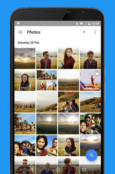
The search FAB thus distracts the user from an immersive photo-browsing experience, which is the primary purpose of the app in the first place. Granted, smart photo searching is a unique function of Google’s Photos app. But does it mean it should be given a top-level, persistent FAB in the app? (I think not.)
Ironically, Google agrees with me. On its Material Design page about FABs, Google explains that “not every screen needs a floating action button.” It then goes on to add that “the primary action is to touch images in a gallery, so no button is needed.” Oops.
They stand out — and stand in the way.
This might feel like another side of the same coin, but there’s another, perhaps more important, implication of the FAB getting in the way. By taking up real estate on the screen, the FAB effectively blocks content.
But hey, the FAB is just a small circular button, right? How much content could it block?
If you look at the screenshot of the Photos app, you’ll realise that the search FAB blocks around 50% of an image thumbnail — definitely large enough to cover a face or two. That’s an additional scroll needed whenever you want to look at every 4th thumbnail of the last row on screen. And that’s not even the worst case.
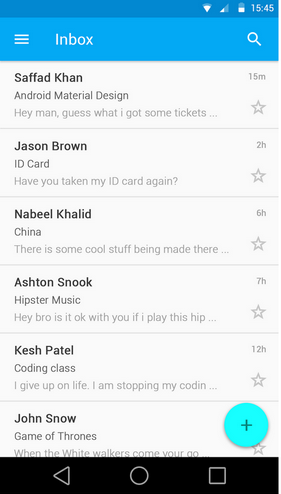
User dumazy posted on Graphic Design Stack Exchange about a problem he encountered when the FAB blocked the “favourite” star as well as the time stamp on his app screen. This illustrates a problem all apps with list views face, and it becomes especially problematic when the last item on the list couldn’t be scrolled up any further.
This means that an entire column the width of the FAB has to be sacrificed (by repositioning the star button, etc.) to allow for proper usability of the screen.
Hence, while it might not seem like it, the FAB takes up way more screen real estate than its size suggests.
Promoted actions might not be used that often.
When doing UX design, it’s useful to remember the 80/20 rule, which states that users will use 20% of the features 80% of the time. In other words, most effort should be placed on designing the few elements that users will use most of the time.
The FAB actually does just that — theoretically. But what if the “promoted action” just isn’t used that often by users?
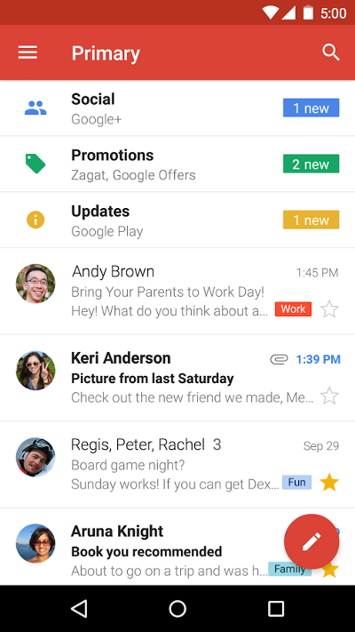
Take Google’s Gmail app for instance.
The Gmail app’s FAB is the compose button, suggesting that the primary action users perform is to create an email.

But is that true?
Multiple studies have shown that at least 50% of emails are now read on a mobile device, but little to none show the same shift in terms of composing emails. In other words, as our daily experiences would likely corroborate, most mobile users tend to use their email apps toread emails on the go.
Perhaps a handful would reply on their mobile devices, but that only happens after opening up an email (note that this means they’ll bypass the FAB). This user behaviour, likely caused by the rather imperfect input mechanism of virtual keyboards and autocorrect, means that the primary action users perform is actually reading (and replying) emails, not creating new ones.
So what does the “compose an email” FAB do? On rare occasions, it provides users with delight when they immediately want to compose an email on the go with the app. But on other times, it just takes up screen space, blocks the star button and time stamp, and is a persistent distraction painted in striking red.
Do we need FABs? Scratch that — Do we even want FABs?
Of course, not all applications of the FAB reduce the experience of using Material apps. There are some shining examples of FABs that make sense, and that therefore enhance the UX of those apps.
Maps by Google is a great example of FAB done right. The main action performed by users on Maps is to get directions, so it makes perfect sense for an FAB that does just that.
But consider that Maps is a pretty special case, where the content users are interested in almost always falls at the centre of the screen (where your blue position dot is). In most apps, however, grid or list views mean that users interact with content located everywhere on screen, including where FABs are most commonly located.
Consider also that the screenshots above only tell part of the story: in actual use, these FABs stay where they are even when users scroll (most of the time). As Google emphasised multiple times in Material Design, motion design is as important as UI design. The lack of motion — the persistence in screen space — in the context of moving content creates a higher level of distraction that screenshots can barely show.
So when examples of good FAB implementation are far and few between, it begs the question: do we need FABs?
When we look at the drawbacks of having FABs on apps, we can boil it down to a simple realisation: users don’t only perform actions on apps, they consume content as well (if not more of the time).
The design of the FAB in Material Design is based on the premise that users perform a certain action most of the time, and therefore it should be accorded an elevated status in the form of a persistent, high-level button. But in many apps, users are focused on consuming content just as much (if not more): in the Photos app, users want to view photos; in Gmail app, users want to read their emails; and in the Facebook app, users want to read their friends’ posts.
The FAB is thus a design philosophy (or at least, a design choice) that subordinates optimal content consumption to action-taking. And we need to ask ourselves: is such a trade-off needed? In fact, is such a trade-off wanted?
When FABs result in diminished UX most of the time, when it’s hard to figure out the single most-used action within an app, and when roundabout methods need to be explored (like an FAB that disappears when scrolled, or lists with differently positioned elements), I’d say the answer is a pretty resounding no.
Google’s Material Design is a pretty damn good piece of unified, principled design language, but the FAB, well, just isn’t that fab.
Comments
Post a Comment